Investors Feel Almost No Risk of Long-Term US Stock Market Downside
Investors feel almost no risk of long-term US stock market downside
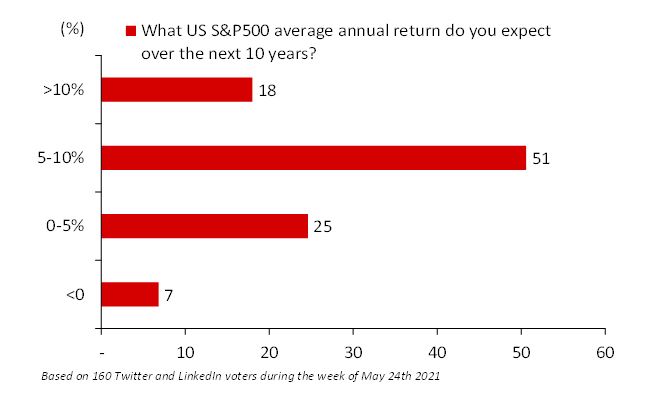
In a poll of my followers on LinkedIn and Twitter, I asked, “What US S&P500 average annual return do you expect over the next 10 years?” At the most extremes, 18% expected greater than 10%, while only 7% said less than zero percent. The majority said from 5-10%. In fact, most people see strong positive returns going forward.
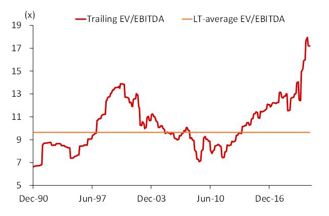
But EV/EBITDA at 17.2x is way above average
The current trailing US EV/EBITDA at 17.2x is very high compared to its 10x average since 1990. This gives most value investors pause, but momentum investors are following this trend. Any investor who believes in the concept of reversion to the mean will be terrified by how clearly overvalued the US is.
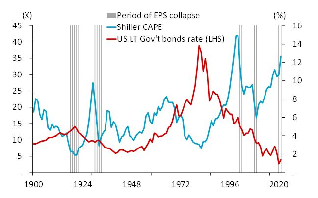
The market hasn’t touched the Shiller CAPE 2000 peak
Robert Shiller’s cyclically adjusted PE ratio (CAPE) is now approaching 35x. It was only higher when it hit 42x during the dot com bubble in 2000. Consider that in 2000 US government long-term bonds were yielding about 5%, versus the current 1.5%. From this chart, you can see that the US market has been in a long bull run since the 1979 interest rate peak.
A fundamental investor knows that the value of a stock is largely dependent on the discount rate, which depends on the US bond rates. The current long-term US government bond rate of 1.5% is clearly supporting share prices. Suppose it was to reverse that it would spell the end of this current market peak. Based on this chart, a fundamental investor would say that the US market is now significantly overvalued.
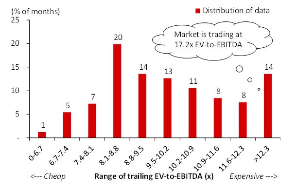
Though expensive, we are not in uncharted territory
We calculated the US stock market EV/EBITDA for each month from 1990 to today. We then broke those into ten deciles from cheapest month to most expensive. After that, we asked, “How often was the market trading in that state?” We found that 20% of the time the US market traded in the decile of 8.1x to 8.8x EV/EBITA. Twelve percent of the time the market traded below 8.1x and 14% of the time the market was trading above the most expensive decile >12.3x. At 17.2x EV/EBITDA multiple, the US market is clearly expensive.
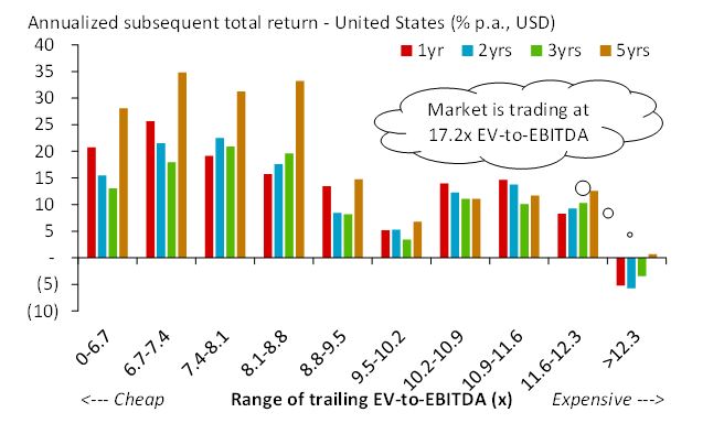
Today’s buyers may not see positive returns
We next asked, “What were the forward returns earned if an investor were to buy the market at each decile?” The results show that if you invested at the most common decile (8.1x to 8.8), you would have earned a 15% return over one year and 35% over five years.
Those subsequent returns start to fall once the EV/EBTIDA rises above this decile (buying an expensive market means less gain). And most importantly, when the market trades in the most expensive decile (where we are now), subsequent 1, 2, and 3 returns were negative. An investor would have to wait five years to get a return only slightly above zero. A fundamental investor would consider this information and have a relatively negative view of the stock market.
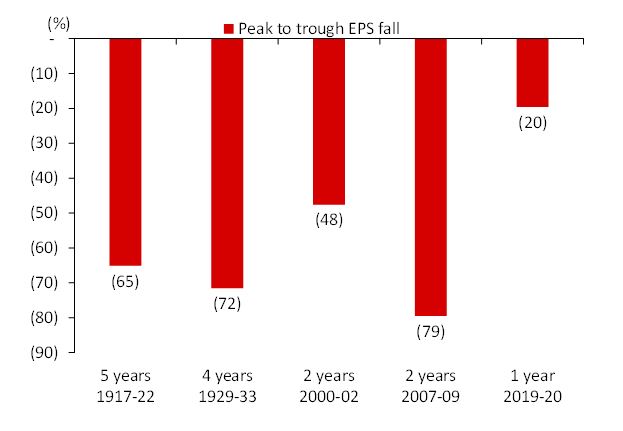
Recent EPS collapse has been much shorter time
The next chart considers the five main falls in earnings per share since 1900. One conclusion is that the fall in EPS has become less protracted. The Great Depression saw a four-year decline in earnings, while earnings fell for only 2 years from the 2000 peak and the 2007 peak. It is also fascinating to see that there was only a 20% fall in earnings in 2020, and that fall only happened over one year (2021 earnings are recovering).
A fundamental investor could look at this chart and think that the recent crisis was quite minimal. This is partly because some sectors (Info. Tech.), some quality (High cash companies) and some size (large) companies did very well during this recent crisis. In addition, since many small or weak companies got destroyed, the supply of products and services has been reduced, which leads to strong pricing power for those that remain.
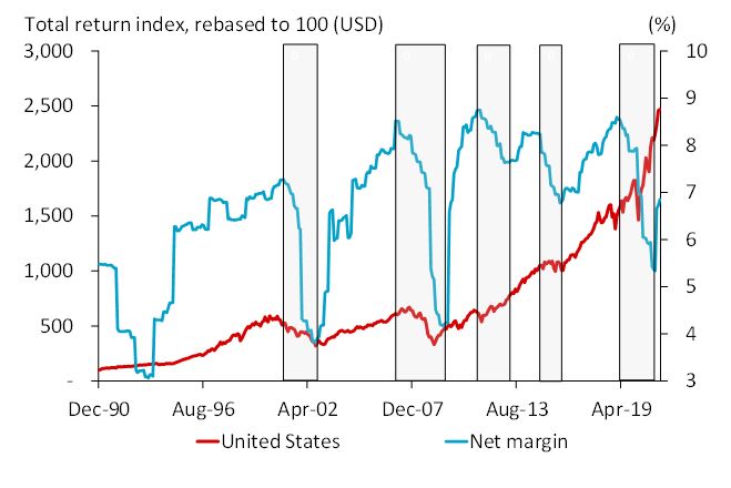
Margin recovery is in place
The net margins of corporate America have been on the rise since 1990. Over the past decade, they have averaged about 8%. The shaded areas on this chart show the period from peak to trough of net margin. The most significant thing about this chart is that the margin collapse is done, and the margin recovery is underway. It is debatable whether the margin can recover to the prior peaks, but it is not unreasonable to say that the margin recovery has further to go. This could be positive for the US stock market.
DISCLAIMER: This content is for information purposes only. It is not intended to be investment advice. Readers should not consider statements made by the author(s) as formal recommendations and should consult their financial advisor before making any investment decisions. While the information provided is believed to be accurate, it may include errors or inaccuracies. The author(s) cannot be held liable for any actions taken as a result of reading this article.