Chart of the Day
Taiwan Was the Best Performer in Asia in 9M23
Asian markets were down in 9M23 except for Taiwan, India, Korea, Vietnam, and Indonesia. Taiwan was the strongest performer in USD and local terms.
Read MoreTaiwan Was the Best Performer in Asia in 1H23
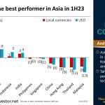
Asian markets were down in 1H23 except for Taiwan, Korea, Vietnam, Indonesia, and India. Taiwan was the strongest performer in USD and local terms.
Read MoreTaiwan Was the Best Performer in Asia in 1Q23
Asian markets were down in 1Q23 except for Taiwan, Korea, Singapore, Vietnam, China and Indonesia in local currencies. Taiwan was the strongest performer in USD and local terms.
Read MoreThailand Was the Best Performer in Asia in 2022
Chart of the Day: Asian markets were down in 2022 except for Thailand, Indonesia, and India in local currencies. Thailand was the strongest performer in USD terms, and Indonesia was the only other market with positive USD return.
Read MoreGold Has More Extreme Return Outcomes Than Equity
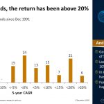
Chart of the Day: We look at rolling 5-year periods starting each month since December 1991 for four asset classes, namely, equity, bonds, commodities, and gold. From this, we can get an idea about the probability of, for example, losing money or earning double-digit returns in each of the four asset classes.
Read MoreA Falling US Dollar Should Support Commodities
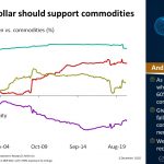
Chart of the Day: Given our expectation of a falling US$, we expect commodities to rise in the next 5 years. We also see economic recovery as a driver.
Read MoreCrypto Is An Uncorrelated Asset Class
Chart of the Day: Bitcoin’s value has grown in value by almost 65,000x. Bitcoin, hence cryptocurrencies, is uncorrelated with other major asset classes.
Read MoreLong-Term Return of Forecasts of Global Institutions
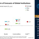
Chart of the Day: We collected long-term return forecasts from 12 large institutions: Amundi, AQR, BNY Mellon, Callan, Franklin Templeton, GMO, Morgan Stanley, Schroders, State Street, T Rowe Price, UBS, and Vanguard.
Read MoreKorea Was the Best Performer in Asia in 2020
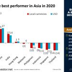
Chart of the Day: Korea, Taiwan, China, India, and Hong Kong were the only markets with a positive return in 2020. Korea was the strongest performer. ASEAN markets performed poorly, worst was Thailand.
Read MoreAre Inflation and Interest Rates Reaching the Bottom?
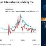
Chart of the Day: The global long-term average inflation has been 2.5%. We are currently at historical lows in both inflation and interest rates. Are we reaching the bottom?
Read More

